
Identity in Action
Woodward Management Partners, EastWood
Brand Development · Integrated Marketing
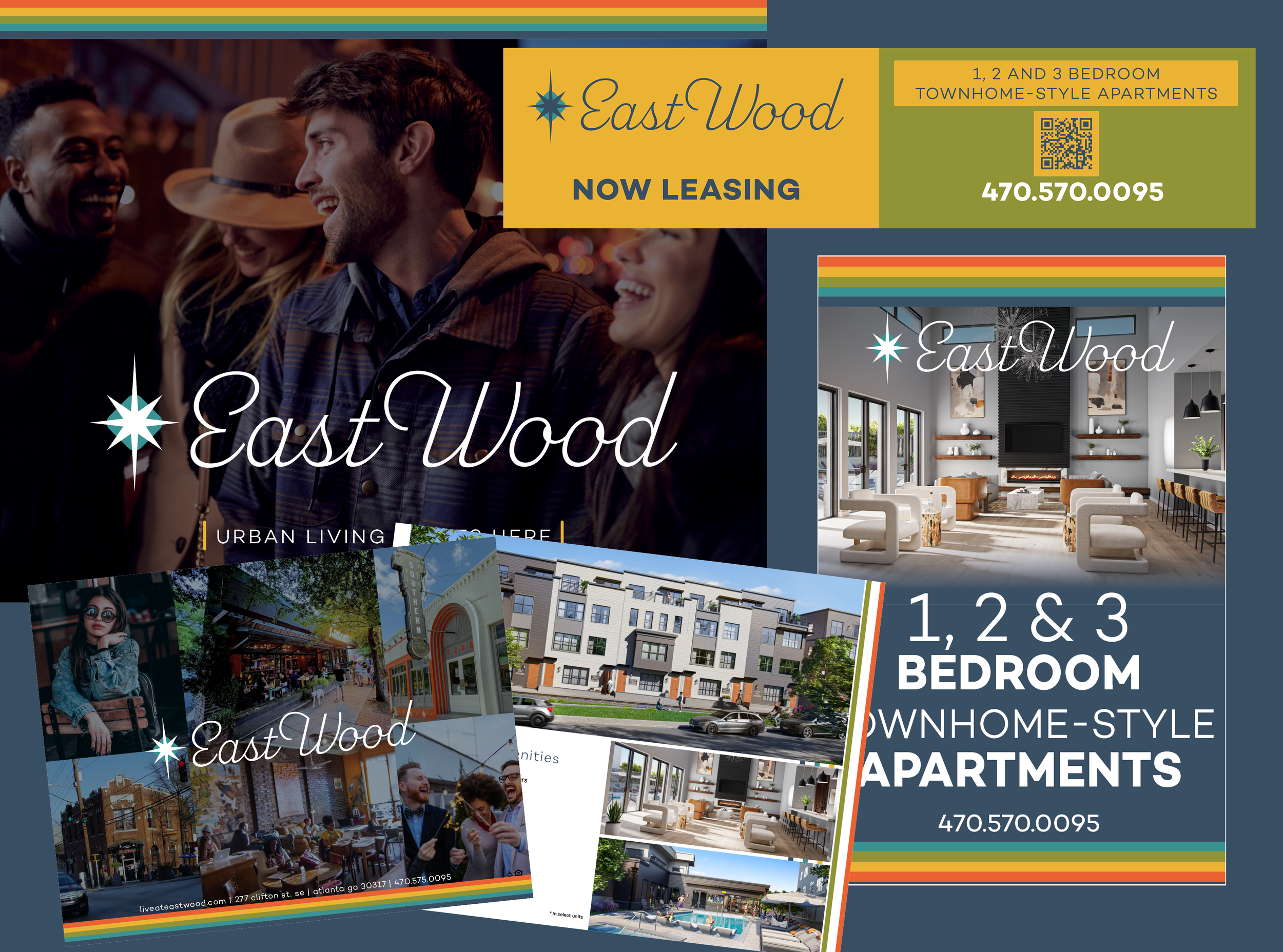
A flexible identity built to work across print, digital and the physical environment.
The Challenge
EastWood was a brand-new residential property that needed an identity before it had much of a physical presence. The brand had to introduce the property, establish its personality and give prospective residents a sense of what living there would feel like.
And it needed to work everywhere, from the logo and leasing materials to the website, signage and construction graphics.
My Approach
I developed the identity from the ground up, starting with the logo, typography, color palette and overall visual direction. From there, I carried the brand across every touchpoint, creating a system that could stay consistent while adapting to very different applications.
The goal was simple: make EastWood feel like a real place people could picture themselves living, even while the property itself was still taking shape.
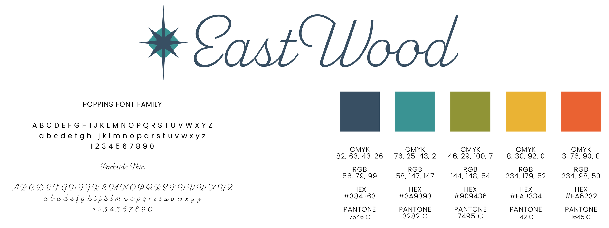
A distinctive palette, typography and graphic language establish the foundation for a flexible, recognizable identity.
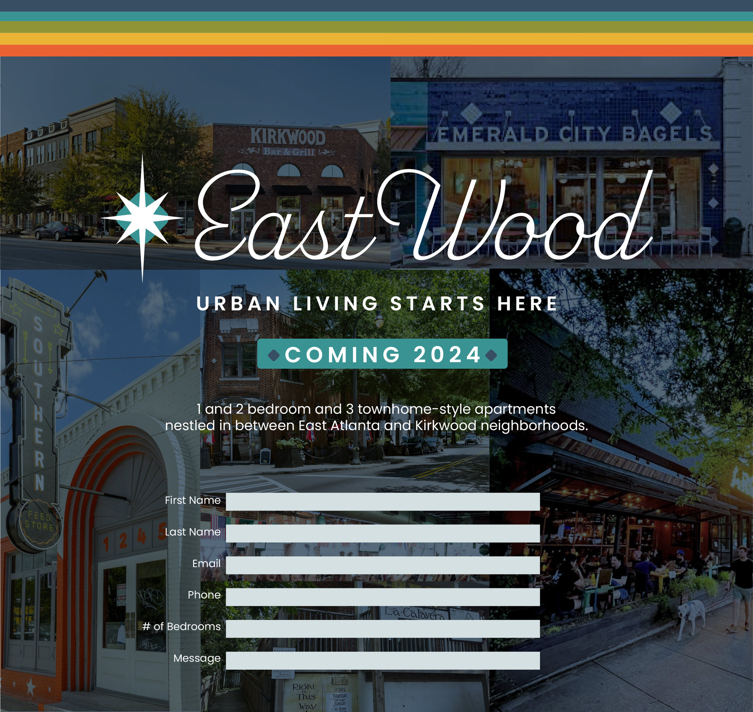
The digital experience carried the same visual language online, giving prospective residents an early introduction to the property and its personality.
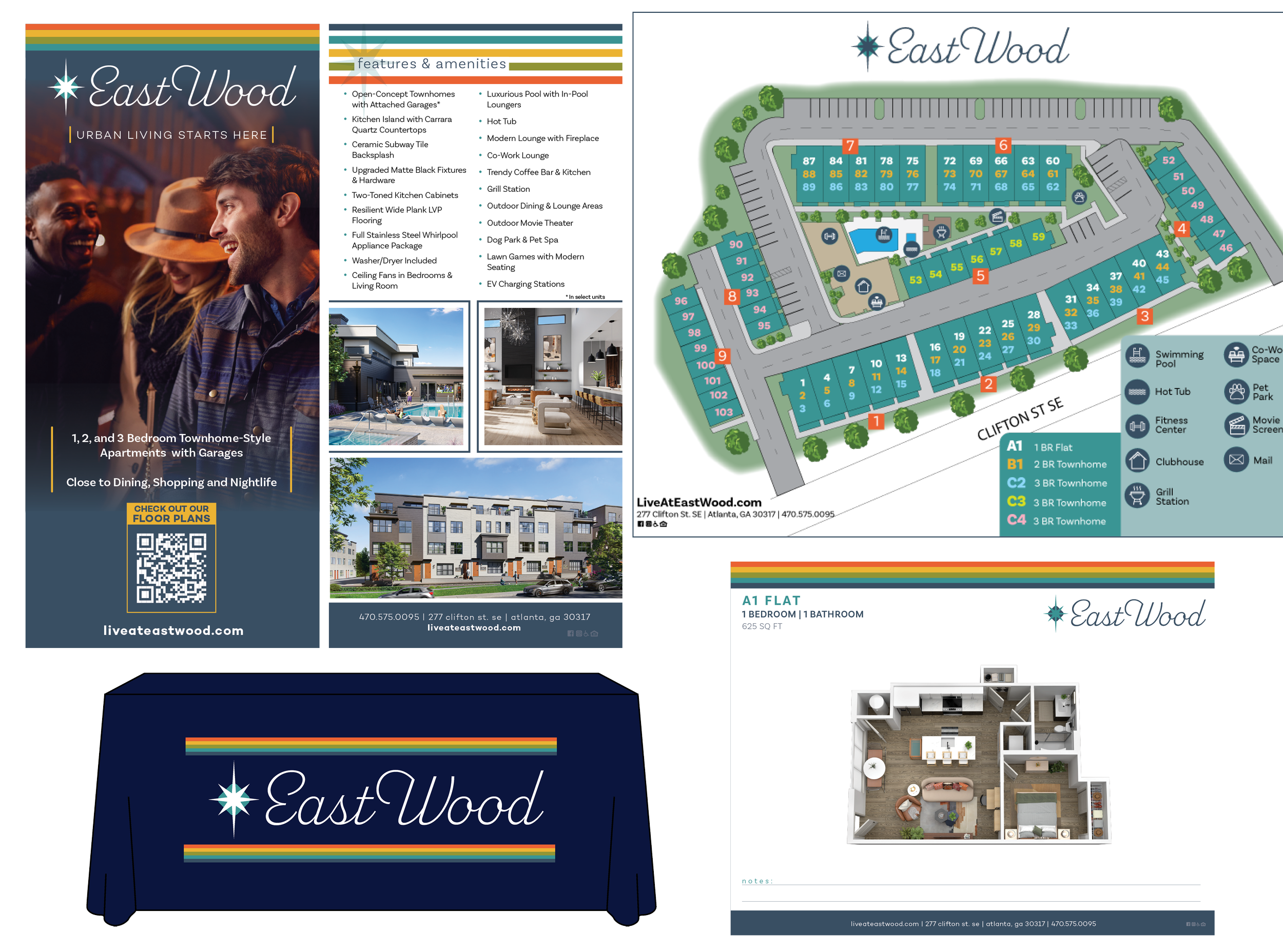
Leasing materials brought the brand to life with a warm, polished look and a clear sense of place.
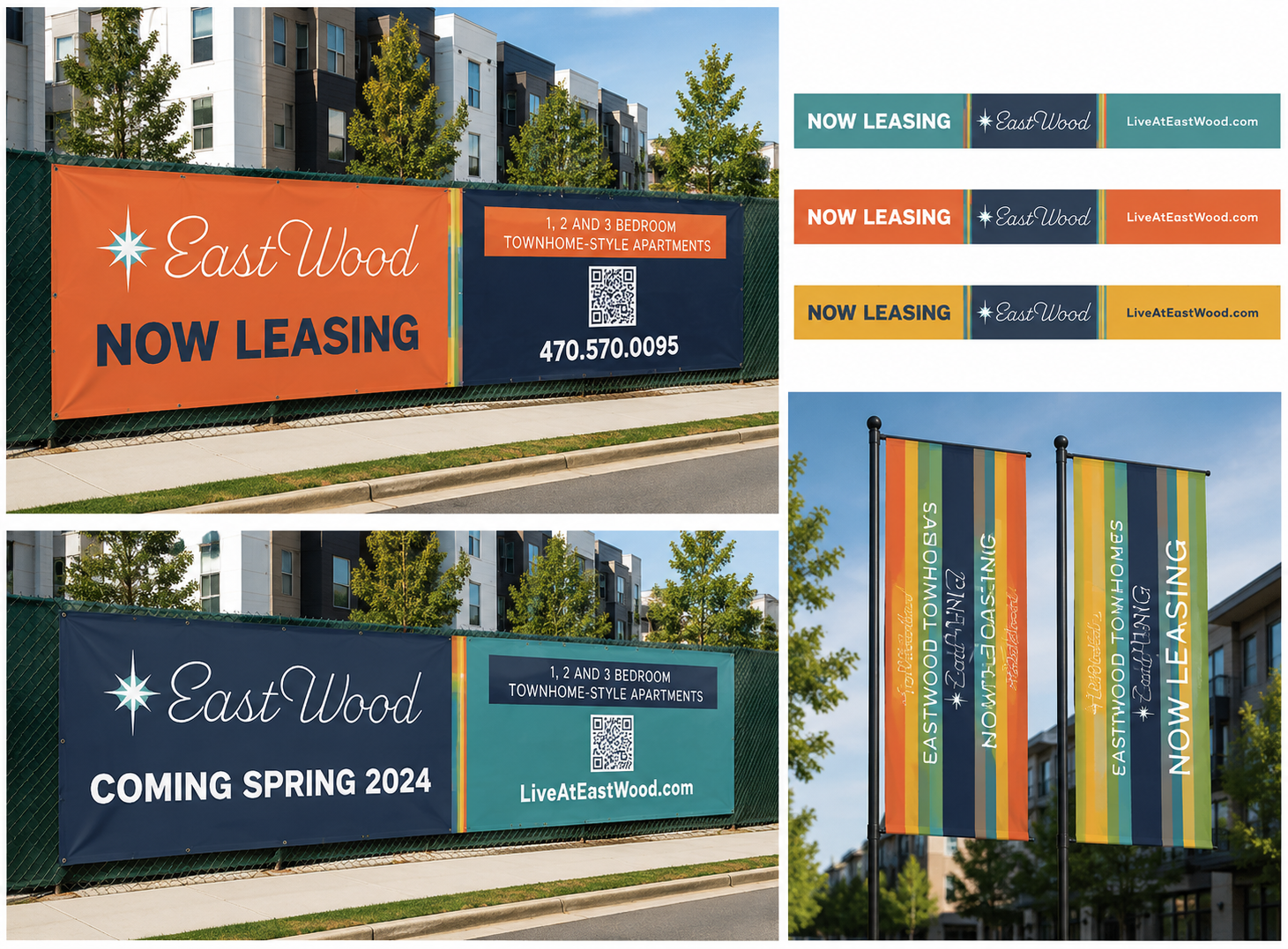
Even during construction, banners, signage and flags helped EastWood begin establishing a recognizable presence.
The Result
EastWood launched with a complete identity that felt cohesive from day one. Instead of treating the logo, website, leasing materials and signage as separate pieces, everything worked together to build recognition and give the property a distinct personality.
It’s the kind of branding project I love: create a strong foundation, then make sure it holds up everywhere the brand needs to go.
Specialized Identity
Citiri ORAT